
How To Make Your Product Page Become The Sales Booster
Every day you witness increasing traffic to your online store. But it does not convert into the real orders that build up your revenue. Understanding this concern, our experts have highlighted some tips for your product page which will make it more convincing and encourage people to spend money all at once.
What does an attractive product page look like?
A successful product page should always be sufficient. The customers expect just enough information about why purchasing your products is the right decision and the buying process has to be as straightforward as possible. The four vital components that form a wonderful product page are your product, your brand name, your copywriting, your page design and users’ experience.
Considering those four factors, this post offers 7 recommendations that will surely inspire the website visitors to add your products to their carts.
1. A call-to-action (CTA) should be obvious
A call-to-action refers to the next step that a marketer wants its reader to take, which always has a direct link to sales. To be more specific, a CTA usually presents as ‘Buy Button’, ‘Add To Cart’, ‘Add To Basket’, ‘Submit Order’, etc.,
The ultimate purpose of your website is to get your stuff sold, and a CTA is a crucial part of this process. Therefore, it should be designed clear enough to prompt an immediate response. A perfect CTA stands out from other contents and this is the first thing that draws people’s attention when they visit the page. The surrounding area should have no obstruction that blocks users from hitting a CTA button.
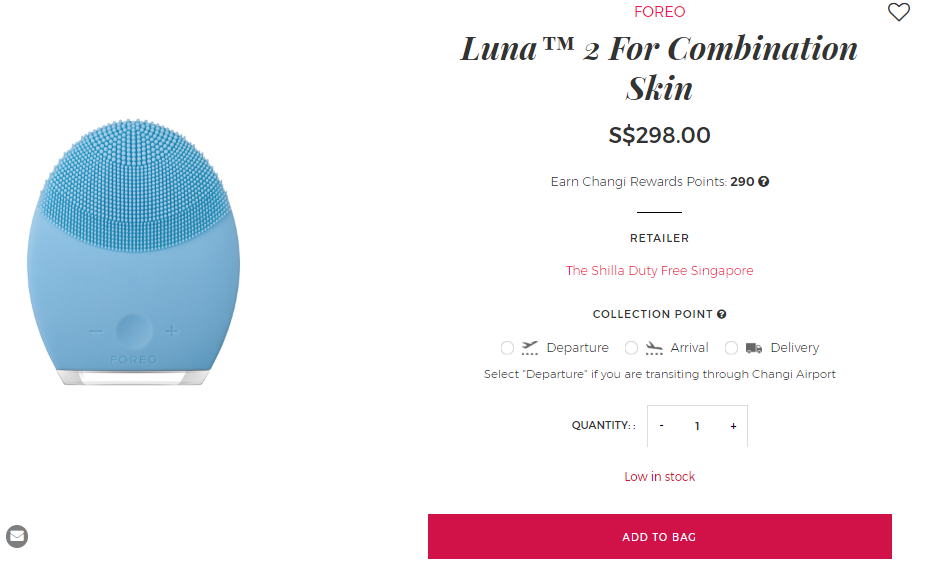
Demonstration of a successful CTA button.
It is easy to recognize that the CTA button takes a spotlight in an eye-catching red background. A perfect killer CTA makes people can’t help but click.
2. Product photography showcases your stuff
When it comes to online shopping, people gravitate towards product images as proof of quality and value. Product photography shapes consumers’ first impression, gives them a hint to whether they should continue browsing this webpage and eventually make a purchase. As a result, investment in the photo creation process is worth the money for sure.
In addition, your product photos also show up on multiple sites including website, e-brochure, ads, social media, etc., Accordingly, it is considered a key part of not only the decision-making process but also retention rates of loyal customers.
Product-only images are usually featured on the product page. Each product should have an album shot on a clear backdrop from all relevant angles. Users are allowed to zoom in to unique details, zoom out for overview, make sure they have the best first experience with your products via great photography.
If your products have different variants, always remember to properly display it on the webpage. It grants people more options in choosing suitable products for them and help to increase your conversion rate.
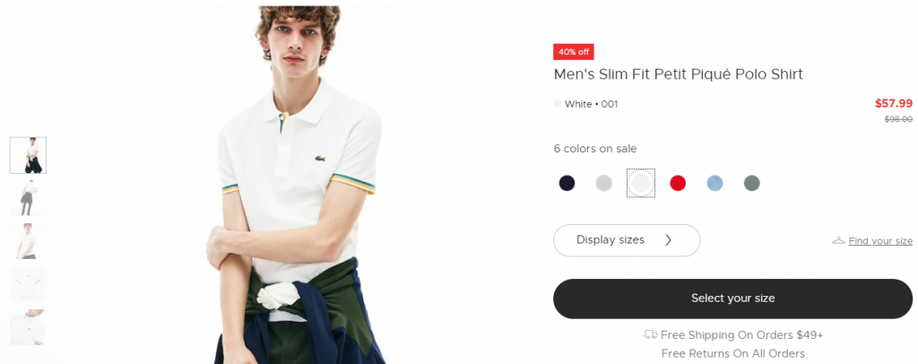
3. Enough information and justifications are provided
You may think that your customers have great knowledge of every detail of the product like you do. However, the truth is totally different. Some of them may be an expert in the field, but most of them have no idea or just begin to know about your stuff. Hence, the information provided on a product page must be comprehensive, practical and easy to understand, even with the newcomers. Useful information can be presented in many sources such as product videos, short clips, product guides, FAQs (Frequently Asked Questions), … You can also get support from functional features like drop-down tabs, overlay or pop-over boxes, hidden content only is shown when you hover on. Those functions guarantee a brief and sufficient webpage. It doesn’t look too crowded with so many words but the customers can still easily find more details if necessary.
If your target market is not so expensive, simple content is preferable. But if your products are considered high-end, the product contents should give reasons for that price. Should it be luxury because of its materials, origins or philosophy? Everything has to be clear and customers’ concerns need to be answered on your product page.
4. A perfect product page increases brand identity
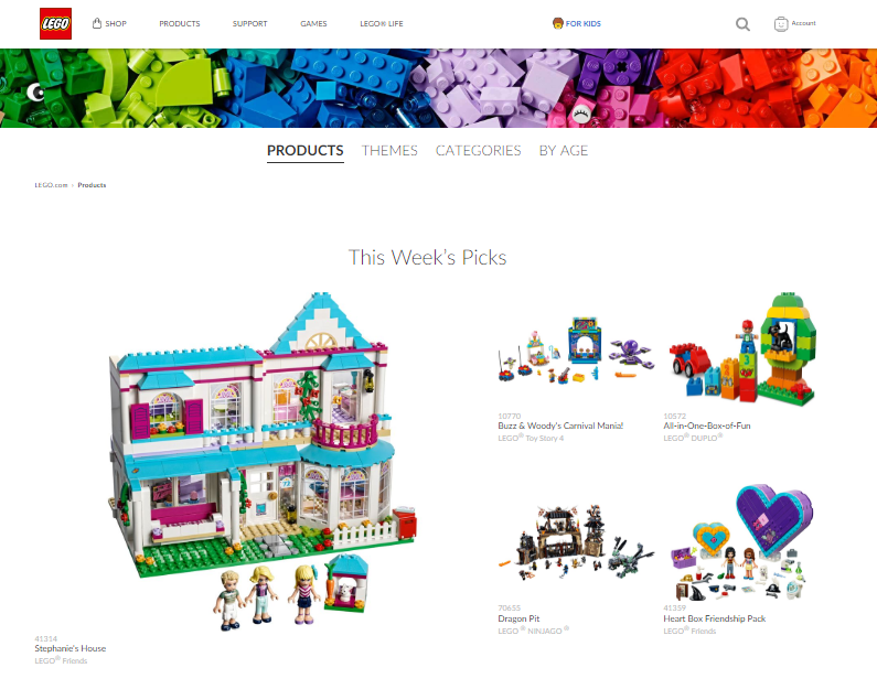
There are a great number of visitors who come to your website through referrals such as other pages, social media, articles, … Therefore, they will be directed immediately to your product page, not the home page where you say who you are and what you do. That’s why your brand name should take a spotlight on your product page. At first glance, visitors must know exactly what the product is all about. It will create the best chance that visitors will convert into customers.
5. Make your products become the desired ones
It is necessary that your product page shows the customers how your products will help and become a life-changing item. More than just fact, product content should also connect with the customers at heart. A successful product page describes customers’ aspiration and proves that there is a real potential to achieve that goal (thanks to using the products on this page).
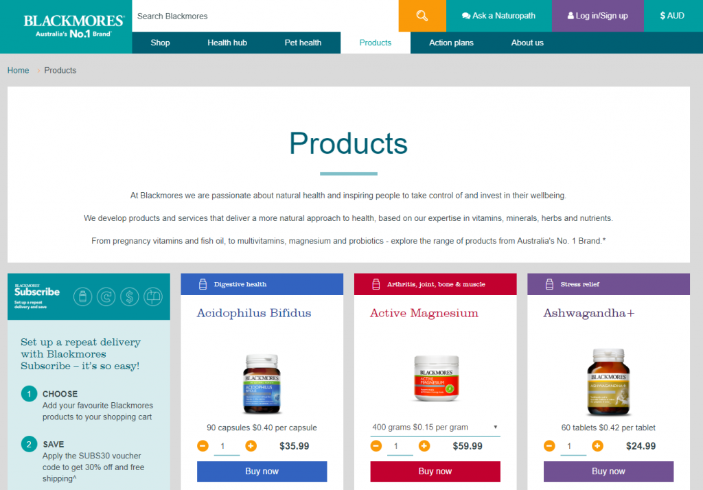
The brand understands everyone’s need
Here you can see that the brand understands everyone’s need to maintain good health and they present it with heartfelt wording so that readers are urged to purchase their items.
6. A great product page is designed with the customers’ voice
Please be noted that most people don’t like too many words. So you should stay focused and put yourself into the readers’ shoes to understand who they are, what they care about and how the interruption of your product into their lives would matter. Content of the product page must take into account customers’ background and suit the products with their needs.
7. Persuasive testimonials should be shown off
When potential customers reach your store and do research on your product page, it is critical to let your happy consumers do the talking. Reviews from previous users intensify trust for new customers, especially for those who are still skeptical about the quality of your products. The authentic proofs really encourage potential buyers to take action right away.
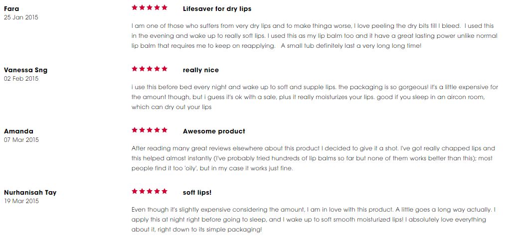
Illustration of how social proof is portrayed
Here is an illustration of how social proof is portrayed. Customers’ feedback is posted together with their ratings for the product. It is a powerful tool that establishes trust in people’s mind thanks to genuine experience.
A successful product page takes efforts and time
Throughout this article, it is apparent that raising your revenue thanks to a complete product page is not as easy as pie. You have to reach the customers both visually and emotionally, bring them the most satisfying experience in comparison with thousands of competitors out there. And luckily you can get support from a series of Shopify apps, which assist you in this long but happy-ending way.


